How to create an accordion hover effect with box-shadows
In this tutorial we'll use the box-shadow property to create a layered card component, and animate it on hover.
The box-shadow property explained
To add shadows to a box we'll need to specify several things in the box-shadow property:
x-offset: Position on the x-axis. A positive value moves the shadow to the right, a negative value moves the shadow to the left. (required)y-offset: Position on the y-axis. A positive value moves the shadow to the bottom, a negative value moves the shadow to the top. (required)blur: How much blur the shadow should have. The higher the value, the softer the shadow. The value is set to 0px, meaning no blur, by default. (optional)spread: How much larger the shadow should be compared to the component. A positive value makes the shadow larger than the box, a negative value makes the shadow smaller. (optional)color: Which color the shadow should have. The default value is the text color. (optional, required for Safari)inset: The position of the shadow. By default the shadow is outside the box. Setting inset moves it to the inside. (optional)
box-shadow: [x-offset] [y-offset] [blur] [spread] [color] [inset];
For example:
You can read more about box-shadows on W3Schools or css-tricks. My CSS-only polaroid camera is built using box-shadows as well.
The card component
We don't need to write any additional HTML to add the stacked cards in the background. We'll start our tutorial with the following code:
    <div class="card">
        <p>Similar post</p>
        <h2>How I recreated a Polaroid camera with CSS gradients only</h2>
    </div>
Translating cards into shadows
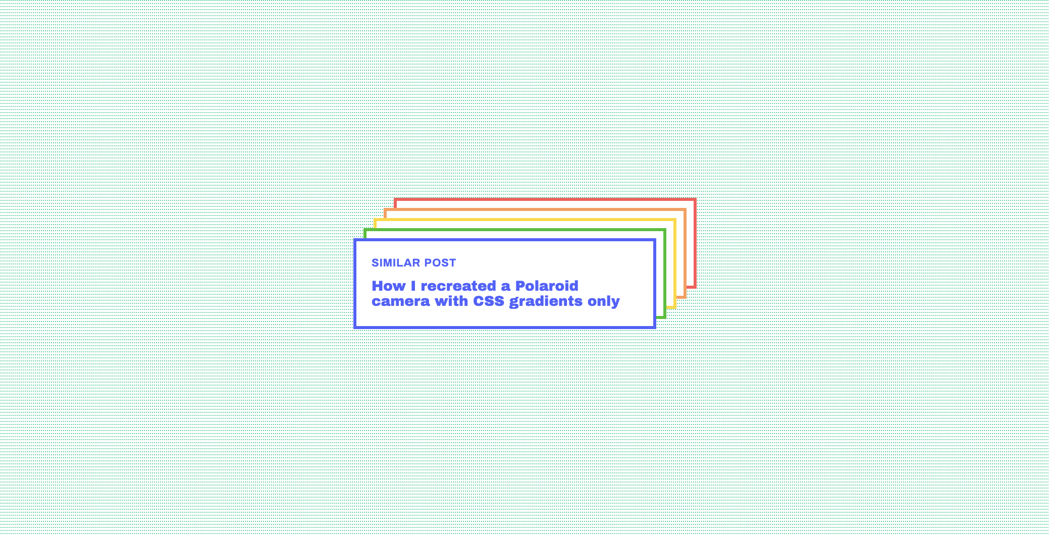
We want to stack 4 cards behind our component, each with the same border width (3px) and same background (white) but a different position and border color.
This means we'll need to draw 8 shadows: one for each color/border, and one for each white fill.
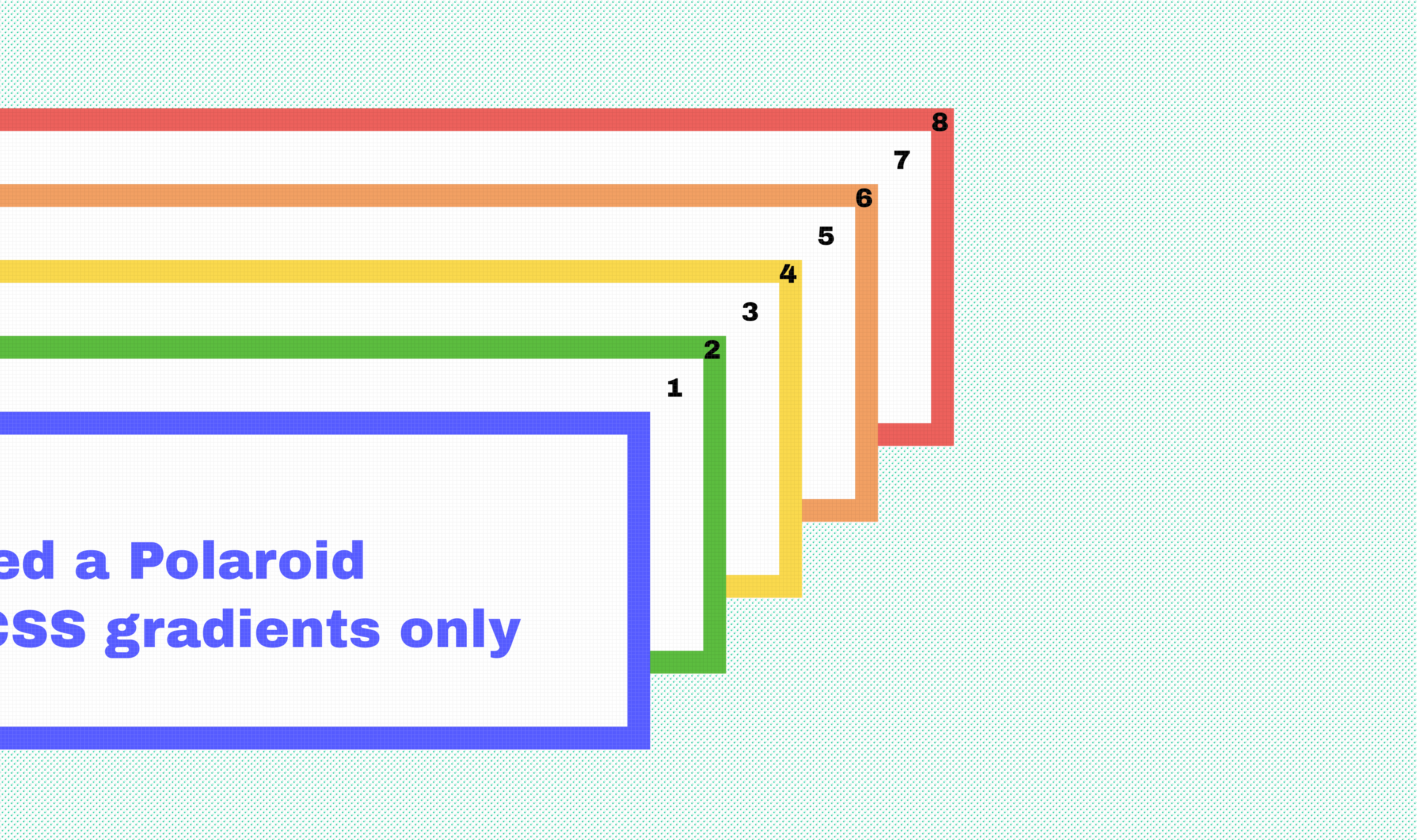
Adding the first background card
We'll start by adding the first green caed behind the component. Let's take a look at its requirements:
- Move 10px to the right
- Move 10px to the top
- No blur
- Same size as container (no spread)
- Green color (#5CBD3F)
This translates into CSS like this:
box-shadow: 10px -10px 0 0 #5CBD3F;
Combining shadows to create fills and borders
Next, we have to draw a white shadow on top of the green one to mimic the white fill of the box.
The border should be 3 pixels thick, so the white shadow should be 3px smaller than the colored one on each side. We can do this by setting a negative spread:
box-shadow: 10px -10px 0 -3px white;
When adding several shadows, the one that's listed first will be rendered on top. So our code will now look like this:
box-shadow: 10px -10px 0 -3px white, 10px -10px 0 0 #1FC11B;
Repeat the same process three more times for the other colors, and keep moving the shadows 10px upwards and to the right.
    box-shadow: 10px -10px 0 -3px white, 10px -10px 0 0 #1FC11B, /* Green */
        20px -20px 0 -3px white, 20px -20px 0 0 #FFD913, /* Yellow */
        30px -30px 0 -3px white, 30px -30px 0 0 #FF9C55, /* Orange */
        40px -40px 0 -3px white, 40px -40px 0 0 #FF5555; /* Red */
Adding the hover animation
Now that the design is in place, the only thing left to do is adding the hover animation.
All the cards will have to move from their original position to the position of the red card in the back. The first step is to change the position of our component.
.card {
    position: relative;
    top: 0;
    left: 0;
    transition: left 1s, top 1s;
}

.card:hover {
    top: -40px;
    left: 40px;
}
The shadows still move along with the component because the offset is still the same. All the shadows have to move towards the same position as the box, meaning their horizontal and vertical offset has to be set to 0.
.card {
    position: relative;
    top: 0;
    left: 0;
    transition: box-shadow 1s, left 1s, top 1s;
}
.card:hover {
    box-shadow: 0 0 0 -3px white, 0 0 0 0px #1FC11B,
        0 0 0 -3px white, 0 0 0 0px  #FFD913,
        0 0 0 -3px white, 0 0 0 0px  #FF9C55,
        0 0 0 -3px  white, 0 0 0 0px  #FF5555;
    top: -40px;
    left: 40px;
}
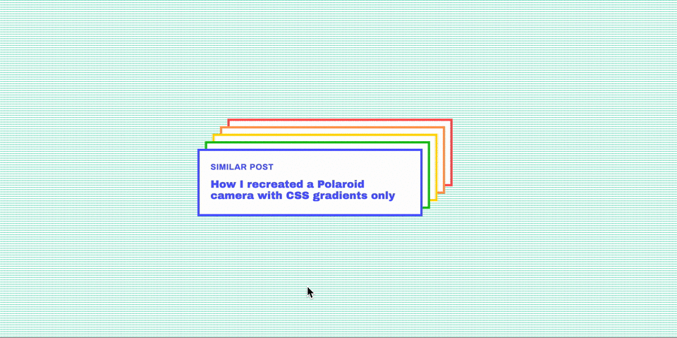
This gives us our desired end result:
More border effects using box-shadows
Posted on 2020-03-13
Similar post | 2020-02-01
How I recreated a Polaroid camera with CSS gradients only
css front-end tutorial